
Choosing a neutral palette can be simple and beautiful. Charlotte Starling shows you how to get the balance right
A beautifully-balanced scheme of whites, greys, taupes, chocolates and charcoals is the epitome of soothing elegance. Think white cathedral ceilings, natural wood, a classic Eames rocker - it’s a look that embraces restraint and calm rather than quirky and clutter. A palette of pale shades stays quietly in the background and is perfect for a bedroom or indeed any room requiring a sense of serenity.
To imbue a room with character and mood without any strong sense of a particular colour, your first port of call should be variations on a white or cream scheme. Look at your room as if it were a black and white photograph. To pull off an effortlessly elegant neutral look you need to make sure you have a harmonious balance of light and shade - pale paintwork being the light and textures being the shade.
Walls should be light, but to avoid looking too clinical stick to a palette of warm off-whites (vanilla or antique white), or if your room is sunny and south-facing, chose one of the cooler shades like dove or chalk. Avoid brilliant white as this will dilute the subtle effect and make the room feel murky.
A clever trick is to take one colour and paint the ceiling in the lightest shade, the walls the next shade darker and the woodwork in the darkest. The subtle graduations in tone will alleviate any potential blandness. However for a small space, painting out the ceiling, walls and woodwork in the same colour will create the illusion of space, as there will be no visual breaks to disturb the eye.
Nothing if not versatile, neutrals will make any strong architectural features such as cornicing or a fireplace really come to the fore. Give a feature like a fireplace plenty of ‘negative space’ to help it stand out. By which I mean, don’t cover it with clutter.
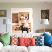
Neutral rooms can easily feel bland, dull and rather unfriendly if not properly considered; the interplay of patterns and textures will enliven the space. You can use several different types of pattern if you opt for similar shades. For example a wide stripe juxtaposed with a small floral design.
My preferred method is to layer different textures and combine natural materials such as wood, linen or metal to bring life to the space and create a soothing, timeless feel. The ‘colour’ then comes from say a honey-toned wood floor or a hide rug. Bring in subtle lustre with soft metallics – silk and damask, chrome and glass. As long as you keep the colours pared back, you can really go quite OTT on glamour. A crystal chandelier, a giant pair of antlers, will still appear tasteful if done right.
A combination of matt and shiny surfaces will also boost a totally neutral room. Dark matt-stained wood floor and leather chairs work well with soft-sheen fabrics and glass accents. Go for beautiful wood grains and heavily woven wool or slubby linens combined with soft velvets. The key is to stick to natural textures and highlight their understated beauty by not introducing too many accessories or a bright colour.
If this all feels too restrained, then chocolate and cocoa brown are perfect neutrals to introduce to make it feel more cosy and inviting. Another way to bring your room to life is with lots of plants. Greenery adds colour. Frothy Boston ferns, antique glass terrariums filled with plants with sculptural leaves both make perfect finishing touches.
--------------------------------------------------
Read on
Top tips on getting the vintage look right at homeInterior designer Charlotte Starling shares her ideas for decorating your child’s roomCharlotte Starling shares her tips on creating a modern rustic kitchen