
When printmaker Clare Dales embarked on an illustrated ABC celebrating the natural, historical and architectural oddities in her home town of Eastbourne, she little realised it would take her on a fascinating journey of discovery. She talks to Angela Wintle about the rewards of lino printing

Hunched over a table in her studio, the mellifluous tones of Radio 4 playing softly in the background, Clare Dales cuts around the pencil outline of a butterfly resting on a kidney vetch. As she slices deep grooves into the surface of her linoleum block with practised ease, lino shavings pile up beside her like rough tobacco.
After about 40 minutes, she stops to assess her work. Satisfied with her progress, she inks her block with a roller and carefully positions a sheet of lightweight paper over the surface of her design before pressing firmly. As she tentatively peels off the paper to reveal the print beneath, her face creases into a smile. This time the unpredictable printing process has proved an undoubted success.
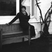
Clare, 48, an Eastbourne-based printmaker, is working on her first solo publishing project: a quirky little book entitled Eastbourne – An Alphabet: A Journey in Print which takes readers on an “intriguing and unexpected journey” around her East Sussex home town.
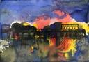
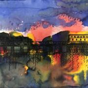
Using the letters of the alphabet as the springboard for each of her chosen subjects, and selecting linocut as her medium (though often with mixed media), the book is a celebration of the town’s many facets. These range from flints from its Neolithic past when the first farmers shaped the area’s distinctive “whale-backed” Downland landscape, to the town’s numerous architectural idiosyncrasies, such as the glazed terracotta faience decoration on the bandstand and its distinctive cast-iron bollards, “resembling smart soldiers standing on guard”.
“I wanted to show Eastbourne as the diverse place it is,” says Clare, who is a member of the Lewes Printmakers and regularly exhibits and sells her work through artists’ open houses. “At the very edge of England, with strong connections to the sea and agriculture, it’s often thought of as a Victorian town, with little mention of what came before and how that shaped our environment. But there have been settlements here for at least a thousand years and Roman remains still survive under the end of the pier.
“It is this historic layering that makes the town so interesting – and why there are many hidden treasures waiting to be discovered.”

Clare approaches her subjects with an enthusiasm and fresh engagement that has made even seasoned locals reappraise old, familiar landmarks – whether it’s the graphic quality of the old bathing machines that once lined the beach front, the inner workings of the pier’s Camera Obscura or the intriguing and usually hidden contents of the town’s colourful beach huts.
For the letter G, she chose the distinctive 1960s tiles outside Fusciardo’s Gelataria on Marine Parade, accompanying it with the designs of the little waffle biscuits that the owners, Antonia and Anna, serve with their ice-cream. “It’s the quirky little details that draw my eye and I’ve lost count of the number of people who’ve turned to those pages and said, ‘Oh, I know where that is...’ ” she says.
“Similarly, the decorative red-brick designs I illustrated for the letter D are nearly all to be found at the town hall, the jewel in Eastbourne’s architectural crown. Designed in 1886, the building retains all its original features and was built at a time when no expense was spared.
“I also made several fascinating discoveries for myself. When I was stuck on the letter H, I visited Holywell Gardens where I discovered an odd, empty-looking building which turned out to be a telephone network cable shed, once part of a vast cable network stretching across the British Empire. I also took a boat trip six miles out to sea to take a privileged close-up look at the Royal Sovereign Lighthouse, which has warded ships off the treacherous sandbanks and rocky reefs that line this coastline since 1971.”
Having chosen her subject, Clare usually makes a rough sketch in situ, though if she’s focusing on, say, the town’s bandstand, she’ll hone in on an assemblage of architectural elements rather than the entire structure. “The key to a good linocut design is to simplify and distil the characteristic parts,” she says.
The next stage is to transfer the sketch onto a lino block, remembering that the design has to be in reverse. “This takes practise and I’ve made many mistakes,” she smiles. “If I’m working on a complicated design, I might draw gridlines onto the block before transferring the image.” Using knives and gouges, she then cuts away the areas of the design that she doesn’t wish to print to create a relief pattern.

One of the advantages of working in lino, she says, is that you don’t need many tools. “If I’m using water-based inks, I use a rubbery substance called Easy Cut lino. But my favourite lino is made the traditional way from linseed oil and wood pulp, backed with hessian, which you can buy from specialist art suppliers.”
Once an image is completed, she often checks what the reverse design will look like by taking a pencil rubbing or holding it up in the mirror. Then she is ready to print. “If you’re doing just one colour print on plain paper, you roll out the correct amount of ink and place the paper on top of the block,” she says. “Too little ink and you’ll get no image; too much and it will seep into the fine lines you’ve been patiently cutting. If you over-ink, you have to scrub down the surface and start again.
“If you’re working on a large area, you might wish to put it through a printing press, but if it’s smaller you can burnish it with a flat tool called a barren, although many people simply use a wooden spoon. Then you peel back the paper and grin or swear, depending on how it has turned out.”
Clare, who grew up near Horsham, took up printmaking 16 years ago after attending a one-day workshop near Battle. She has no formal art training, and instead studied archaeology and then architecture at degree level, before completing a masters degree in heritage management – enthusiasms clearly reflected in her designs.
In tandem with her current work as a freelance design and heritage consultant, she now runs printmaking workshops and undertakes commissions using a range of skills.
Already working on her second book, it seems this talented printmaker is determined to leave her mark.
Good to know
Eastbourne – An Alphabet: A Journey in Print by Clare Dales is available via Amazon, Waterstones in Eastbourne, Much Ado Books in Alfriston, City Books in Hove and Steyning Bookshop at £15; facebook.com/claredalesart.
More…
• How artist Jill Tattersall is marking the 950th anniversary of the Battle of Hastings - To mark the 950th anniversary of the Battle of Hastings artist Jill Tattersall has recreated the constellations on that fateful night. Duncan Hall finds out more about her inspirations and life